Solright Branding and Packaging Design
《Solright》 品牌設計
品牌簡介:
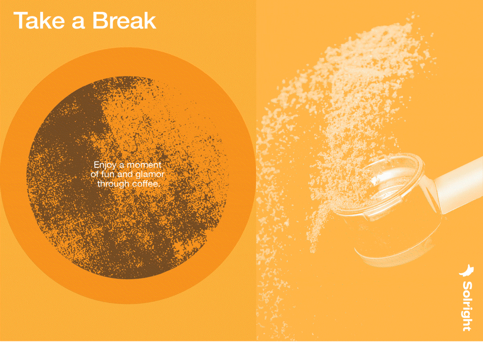
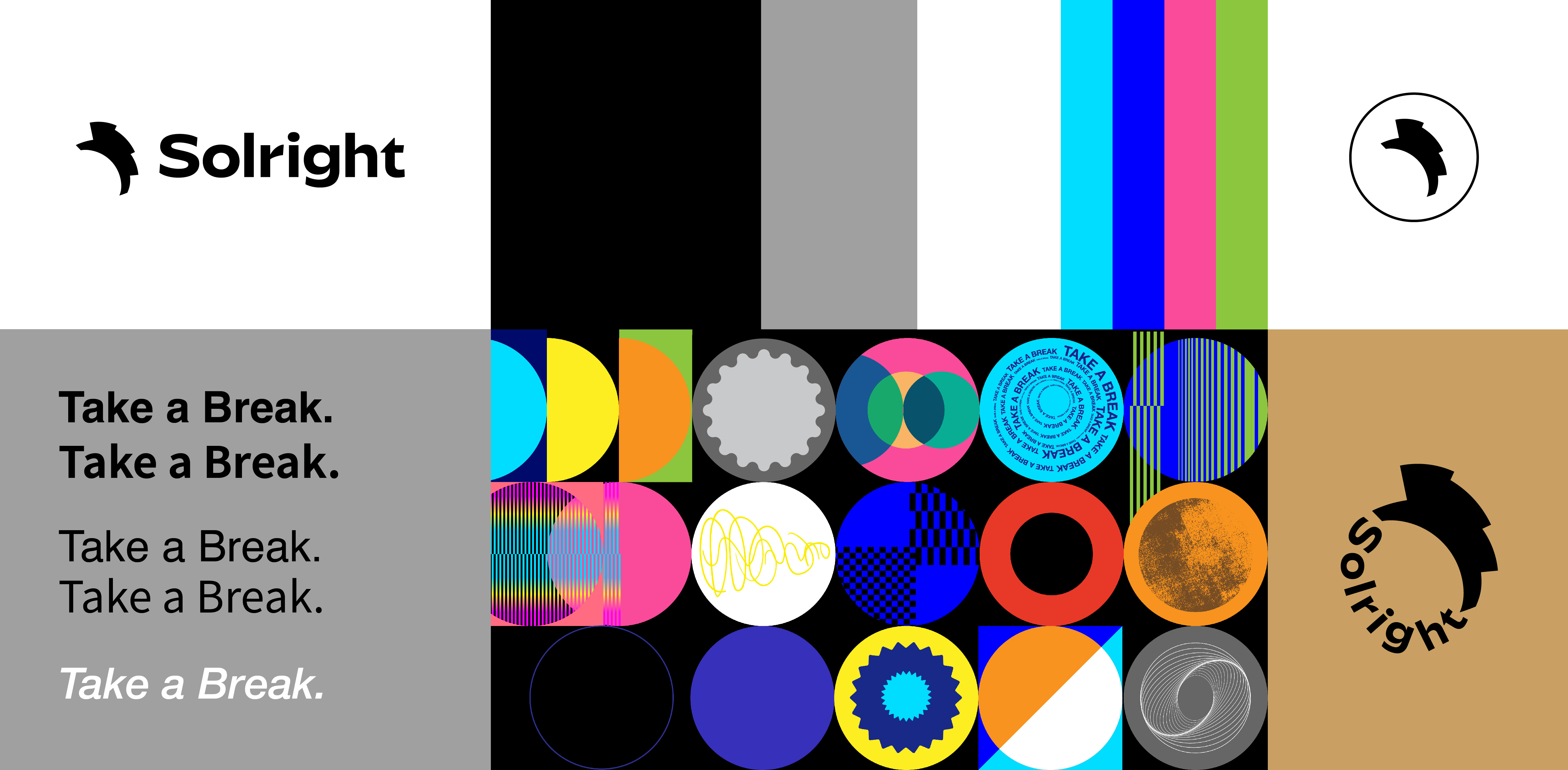
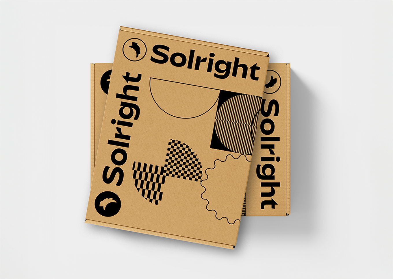
Solright 手動磨豆機品牌,從字面上解讀:Sol 代表「陽光」,而 Right 象徵著指引走向想要的方向。在磨豆時,手柄轉動的軌跡、手沖在濾紙上移動的弧線、義式咖啡機旋蓋的動作、杯面的形狀,以及時間也是圓的,標誌與輔助圖形就以圓形為基礎展開。
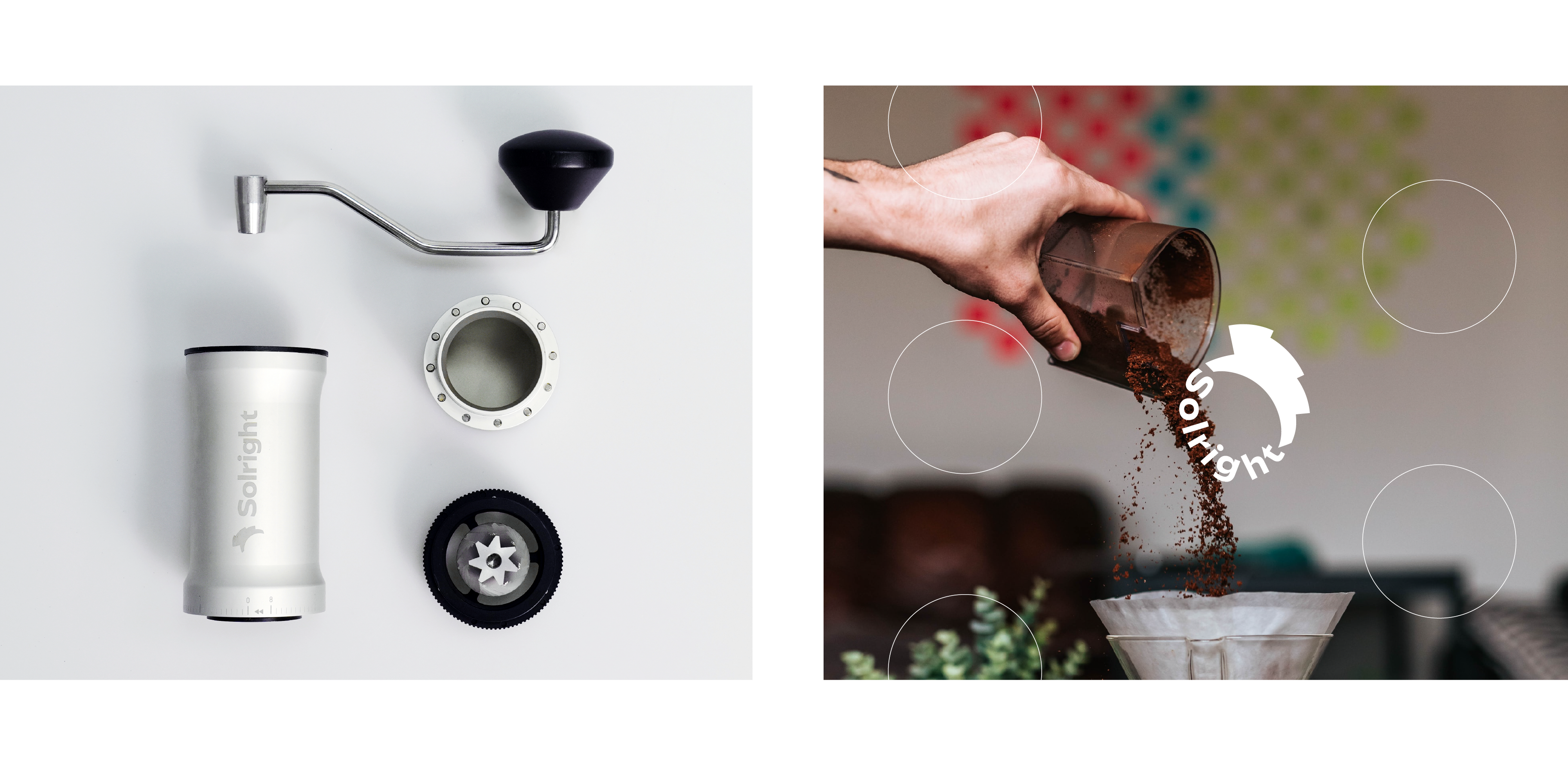
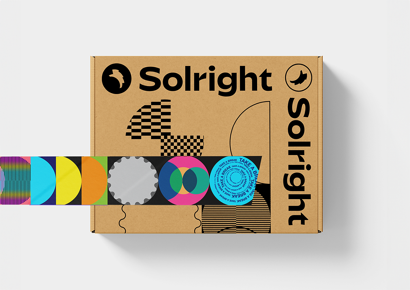
Solright Manual Coffee Grinder — Brand & Packaging.
The design is built on the concept of "Circle," reflecting the movement of the grinding handle and the surface of a coffee cup. It defines the brand's identity through minimalist geometric forms and premium packaging.
.客戶 Credits Client | Solright Team 儀謙有限公司
.品牌企劃 Branding planner | Tim Wang 王騰鋒
.品牌設計 Branding design | Huangya Chiu 邱韹雅
︎Solright|︎Explore products
Solright 手動磨豆機品牌,從字面上解讀:Sol 代表「陽光」,而 Right 象徵著指引走向想要的方向。在磨豆時,手柄轉動的軌跡、手沖在濾紙上移動的弧線、義式咖啡機旋蓋的動作、杯面的形狀,以及時間也是圓的,標誌與輔助圖形就以圓形為基礎展開。
Solright Manual Coffee Grinder — Brand & Packaging.
The design is built on the concept of "Circle," reflecting the movement of the grinding handle and the surface of a coffee cup. It defines the brand's identity through minimalist geometric forms and premium packaging.
.客戶 Credits Client | Solright Team 儀謙有限公司
.品牌企劃 Branding planner | Tim Wang 王騰鋒
.品牌設計 Branding design | Huangya Chiu 邱韹雅
︎Solright|︎Explore products